The Power of Color Psychology in Web Design
When it comes to web design, every element holds the potential to communicate a message. Among these elements, color stands as a powerful visual tool that can evoke emotions, shape perceptions, and influence user behavior.
The strategic use of color psychology in web design can transform a simple website into an emotionally engaging digital experience. Let’s explore the fascinating realm of color psychology and discover how it can be harnessed to create websites that resonate with users on a deeper level.
Understanding Color Psychology

Colors have an innate ability to evoke specific emotions and feelings. This phenomenon, known as color psychology, has been studied extensively and can play a crucial role in web design.
For instance, warm colors like red and orange can evoke feelings of excitement and energy, while cool colors like blue and green tend to promote calmness. By understanding these emotional associations, web designers can strategically select colors that align with the website’s purpose and target audience.
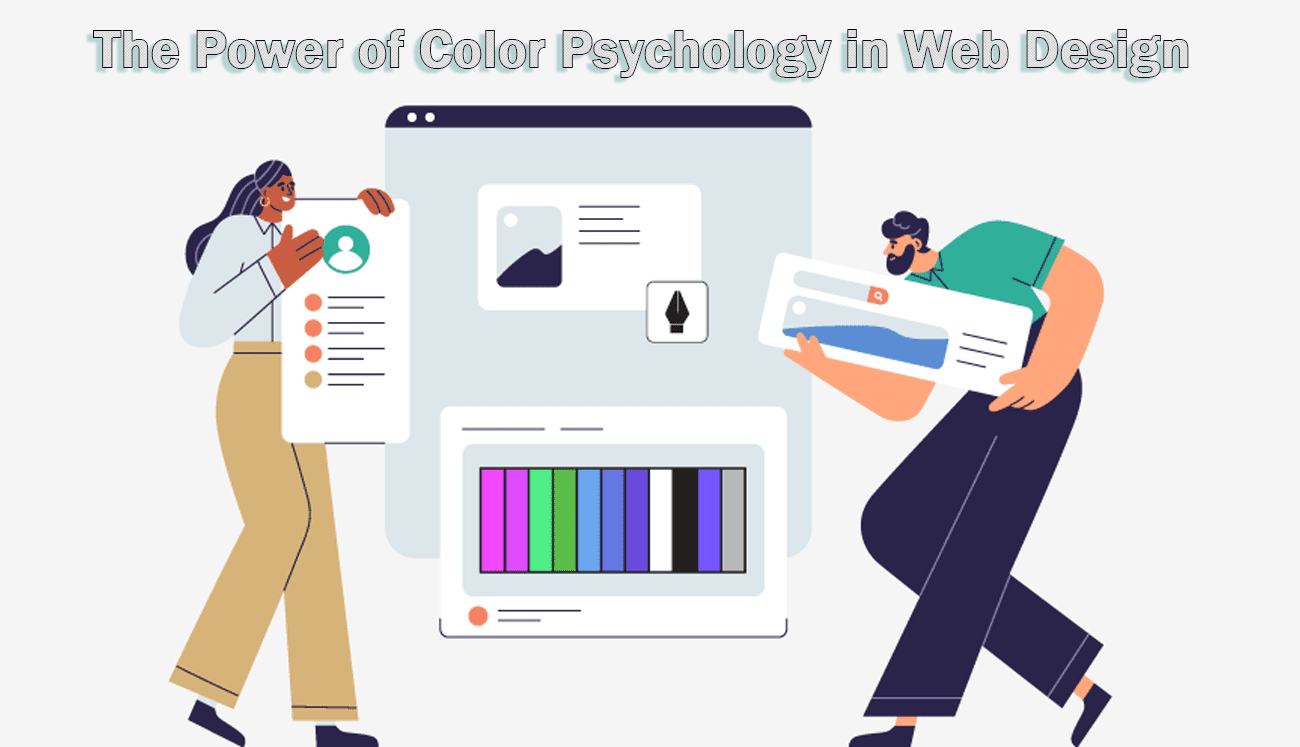
Applying Color Psychology in Web Design
How does color psychology impact web design, you ask? Here are some ways you can incorporate this concept:
Branding and Identity
The color palette chosen for a website can directly impact its branding and identity. Consider the emotional tone you want to convey – whether it’s trust, excitement, or sophistication – and select colors accordingly.
For instance, the use of calming blues and greens can instill a sense of reliability and professionalism. On the other hand, bright and vibrant hues can capture attention and enthusiasm.
Creating Visual Hierarchy
Colors can guide users’ attention to specific elements on a webpage. Bold and contrasting colors can be used to highlight call-to-action buttons or important information, directing users’ focus where it matters most.
Cultural Considerations
Different cultures associate different meanings with colors. A color that symbolizes luck in one culture might represent danger in another. When designing for a global audience, it’s essential to be aware of these cultural nuances to avoid misunderstandings.
Numerous websites have effectively harnessed color psychology to create impactful user experiences. Consider Airbnb’s use of a soft, welcoming palette that aligns with the sense of comfort and belonging they wish to convey. On the other hand, brands like Coca-Cola rely on the powerful and energetic red to evoke excitement and enthusiasm around their product.
Tips for Web Designers
Here are some tips for the web wizards on your team to enhance their game. These tips are sure to make your websites more engaging and attract customers by hitting the right spots.

Summing Up
Color psychology is a powerful tool that web designers can leverage to create emotionally engaging websites. By strategically selecting colors that align with the desired emotional responses and user interactions, designers can shape the overall perception of a brand and enhance user engagement.